SaaS Market Segmentation isn’t About Knowing Your Buyers, but Why They Hesitate
SaaS market segmentation has long been judged by identity metrics. To accelerate conversion rates, it’s time marketers are driven by intent, not vanity.
It’s 2026, and your teams are still segmenting through identity. That’s your yardstick. This won’t help your SaaS brand reach the buyers. What you aren’t focusing on entirely is your account’s “readiness to change.”
On paper, your marketing team would have the ideal 500 leads. But when your SDRs talk to them, you realize these companies are either in a procurement lockdown or tangled in a data mesh- and they belong in a whole different market segment.
Because SaaS companies still segment their market based on identity, while intent is to take the hit. Your target market might mimic your perfect buyers, but they lack the structural pillars to become your customers.
That’s a SaaS marketer’s major pain point- understanding SaaS market segmentation, especially when navigating broader SaaS marketing challenges.
The correct segmentation approach can transform a business by streamlining where to invest and which parts of the TAM must be targeted, much like refining your SaaS marketing budget allocation strategy, leading to actively engaging the buyers who truly hold intent.
You’re hitting the nail on the head with this assumption. But believing segmentation can work wonders, and actually implementing it effectively, are two different things. The gap is in execution.
SaaS Market Segmentation as a Core Business Strategy
Broken segmentation techniques can stunt profit growth, often surfacing alongside poor SaaS marketing benchmarks that misguide decision-making.
The mistake that most SaaS companies make is chasing segments that they aren’t even well-equipped to serve, one of the most common mistakes in outsourcing SaaS marketing and internal strategy alike. It’s the ambitious model. In hopes of reaching large bouts of promising segments, businesses lose sight of the few loyal segments that they could actually convert- the segment they understand.
You can segment your market in a couple of different ways, but aligning it with your SaaS product-market fit is what ensures long-term success. And that all depends on the variables you choose- what are the differences in customer behavior? Why should they be interested in your product? What buying habit/pain point would make them interested in your SaaS product and not your competitors?
The overarching understanding is always- how does your market behave with your category?
Like we say, it’s always ambition that drives the answers to such questions, which should help you segment your market strategically.
Not all brands have disruptive products that engage the market. But it’s a far-fetched dream- to tap into an underserved market segment and curate a killer USP for it. However, that’s the root of all segmentation complexities. Marketers end up casting the net too wide- over amorphous groups.
You try to satisfy a large group, and you satisfy very few—something often seen in diluted SaaS content marketing strategies that fail to resonate. Because your messaging never really sticks. Your marketing framework diverges from the value it was meant to create.
SaaS market segmentation must always ask- does this help iterate how our ICPs make their purchasing decisions, much like a focused account-based marketing for SaaS approach would, or determine usage in our category?
In simple terms, market segmentation means morphing into a framework- for how your brand creates value. That way, a marketing tactic turns into a core business strategy.
Moving into the Underserved Territory of SaaS Market Segmentation
Segmenting according to the “readiness to change” isn’t a small feat and often requires insights from evolving SaaS market trends. It requires planning and strategy to measure it. Because friction is the only honest variable that can offer you accurate segmentation.
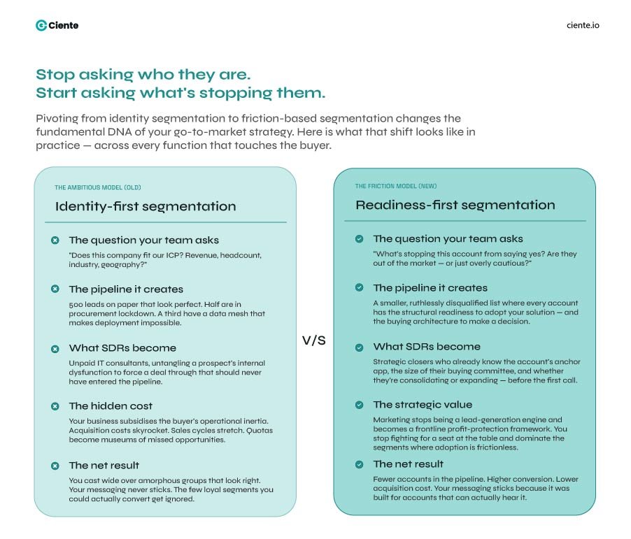
Stop trying to understand who the buyer is—a mindset shift also emphasized in modern AI-driven B2B SaaS marketing strategies.
You’ve enough data- technographic, demographic, and firmographic- to tell you that. Your team must start asking- what’s stopping these accounts from saying yes? Are they out of the market or just overly cautious?
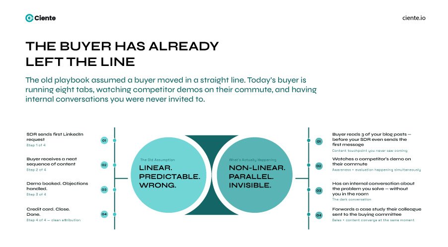
You look at your buyers as numbers that you must segregate based on some variable. But while you’re busy casting that net- the buying committee has already evaluated the hurdles of choosing you- even before they looked at your UI.
In SaaS, your answer can belong to any of three structural gaps-
A. Technical Maturity
SaaS sprawl is a real dilemma for buyers, especially as more industries like manufacturing are switching to SaaS ecosystems.
That’s why your SaaS buyers are overwhelmed with analysis paralysis- they’re stuck with a franken-stack of 250 disconnected tech. This way, your plug-and-play promises in 2026 fall on deaf ears.
The vital pain point that your marketing team didn’t notice? The mismatch between your solution’s data requirements and the client’s data mesh of crumbling tech-stack.
When your marketing team categorizes an account based on revenue, the pain point of “technical debt” often goes neglected. Your team is unaware, but your marketing messages that promise a solution aren’t a blessing in disguise- it’s more noise for them.
For your prospects, their data already exists in siloes across legacy ERPs and is fragmented across unmapped APIs. Adding your tool to this bleed is more of a noise that their IT team doesn’t have the resources to manage. It’s merely another addition to their sprawl.
However, for you, it means SaaS market segmentation must consider attributes such as technical maturity.
How do you identify this integration wall?
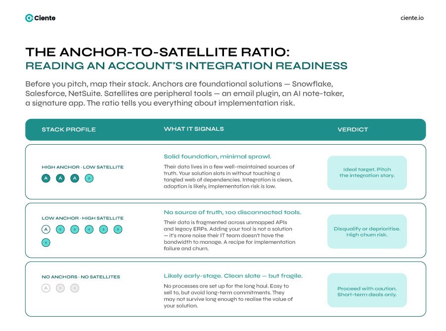
You must first identify the anchor apps (the single source of truth), i.e., outline their tech stack data to grasp an organization’s technical readiness. Use third-party tools to gauge their tech infrastructure or search their job boards to see the technical positions they’re hiring for.
In focus here is the anchor-to-satellite ratio.
Anchors are the foundational solutions, such as Snowflake, Salesforce, and NetSuite, whereas Satellites are the tools- an email marketing software, signature capture app, or AI note taker.
- High anchor but low satellite? Solid foundation with minimal tools. Your software could easily integrate with their existing system.
- Low anchor but high satellite? There’s no anchoring app tethering 100 different tools, which means they’re drowning in fragmented data. Adding on more could only lead to implementation failure and churn.
- No anchors or satellites? The account could be an early-stage startup that you can easily sell to. The only risk you could face here is any long-term commitments, as they don’t have processes set up for the long haul.
SDR pitch: Don’t pitch your product features. Spotlight how your solution can seamlessly integrate with their anchor app.
B. Procurement Fatigue
As a SaaS vendor, you see the potential in your solution—similar to how brands position offerings in successful SaaS marketing campaigns– and that’s how you curate the marketing messages, but it’s not about “what the solution can do.” It boils down to whether it’ll actually work.
That’s where the real anxiety lies.
Your SaaS buyers are haunted by Shelfware- a paid SaaS solution that sits idle because the final adoption plan failed. This is where the utilization dilemma stems from.
You want them to see the potential in your solution, and that’s what the messaging states. But your buyers are asking- what if this turns out to be a waste?
Effective SaaS market segmentation keeps track of that:
- “Do they want to consolidate?”
A business looking to consolidate 10 niche tools into a single platform often evaluates efficiency through SaaS pricing models and ROI frameworks
Focus on efficiency and ROI, and watch the tides turn.
A business that wants to expand needs to build a competitive edge. But marketing messages often dilute two different pain points into a single message- “save 20% of your budget” and “automate 20% of your workflow.”
Treating this as the same segment will ignore your SaaS buyer’s primary stressor. And your conversion rates hit the fan.
C. Decision Architecture
The death of the single-stakeholder sale is your third structural hurdle, making content marketing vs sales alignment in SaaS more critical than ever
You might think your net is catching the right buyers because they fit your amorphous groups. But in reality, that net is getting shredded by a buying committee that has ballooned to 13 or more people.
Many accounts actively want to buy, but without the right SaaS startup marketing strategies, internal friction delays decisions. But their internal bureaucracy is so dense that “no decision” becomes the default outcome.
That’s bureaucratic friction.
If your SDRs treat a highly regulated Fintech enterprise the same way they treat a 50-person creative agency, your sales cycle becomes a hall of mirrors.
The Fintech deal demands a security-first narrative, SOC2 documentation, and a legal gauntlet that will take six months to clear. The creative agency might swipe a credit card by Friday.
Nuanced segmentation requires mapping the regulatory and security burden of the account.
How do you identify this friction?
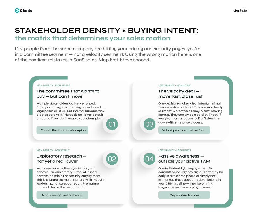
Look at stakeholder density and intent data.
If 12 different people from the same company are visiting your pricing and security pages, you’ve identified a complex committee segment. If only one manager is visiting your features page, you’re in a velocity segment.
The fatal mistake is using a velocity sales motion for a committee segment.
You need to segment by buying complexity, so your team knows exactly which internal enablement kit to hand their champion to convince the rest of the room.
The Cost of Over-relying on Identity Segments for SaaS Market Fragmentation
If your CRM is full of $100M companies that lack the structural space to deploy your software, you don’t have a pipeline. In reality, it’s a museum of missed quotas.
Market segmentation in 2026 isn’t about finding the companies that might need your solution—it’s about refining acquisition through channels like SaaS affiliate marketing and partnerships. It’s about ruthlessly disqualifying ones that’ll bankrupt your resources, trying to adopt them.
Every time your team engages an account trapped in procurement lockdown, your acquisition costs skyrocket, something often amplified by inefficient SaaS social media marketing strategies. Your SDRs stop selling and transform into unpaid IT consultants, trying to untangle a prospect’s internal dysfunction to force a deal through.
That is the hidden tax of the ambitious model. It forces your business to subsidize the buyer’s operational inertia.
Pivoting to a friction-based model will help you change the fundamental DNA of your SaaS market segmentation strategy. Your team stops asking buyers if they’ve got a big enough budget and starts asking about their anchor.
This way, you stop fighting for a seat at a 13-person committee table and start dominating the segments where your messaging actually sticks, and adoption is frictionless.
A “no” from a prospect is rarely an indictment of your product’s features. It’s almost always a reflection of their inability to change.
When you finally align your segmentation with a buyer’s structural readiness, marketing stops being a mere lead-generation engine. It becomes your frontline profit-protection framework.
The bottom line? Stop casting nets over amorphous groups that look perfect on paper. Start hunting precisely where the friction ends.


